Watt’s the Big Deal?
- ROLE
- UI/UX Design
- TYPE
- Webpage Design
- PLATFORM
- Desktop + Tablet
- DESIGN TOOLS
- Figma, Figma Make, Datawrapper
Turning solar power data into interactive data visuals
Visit page
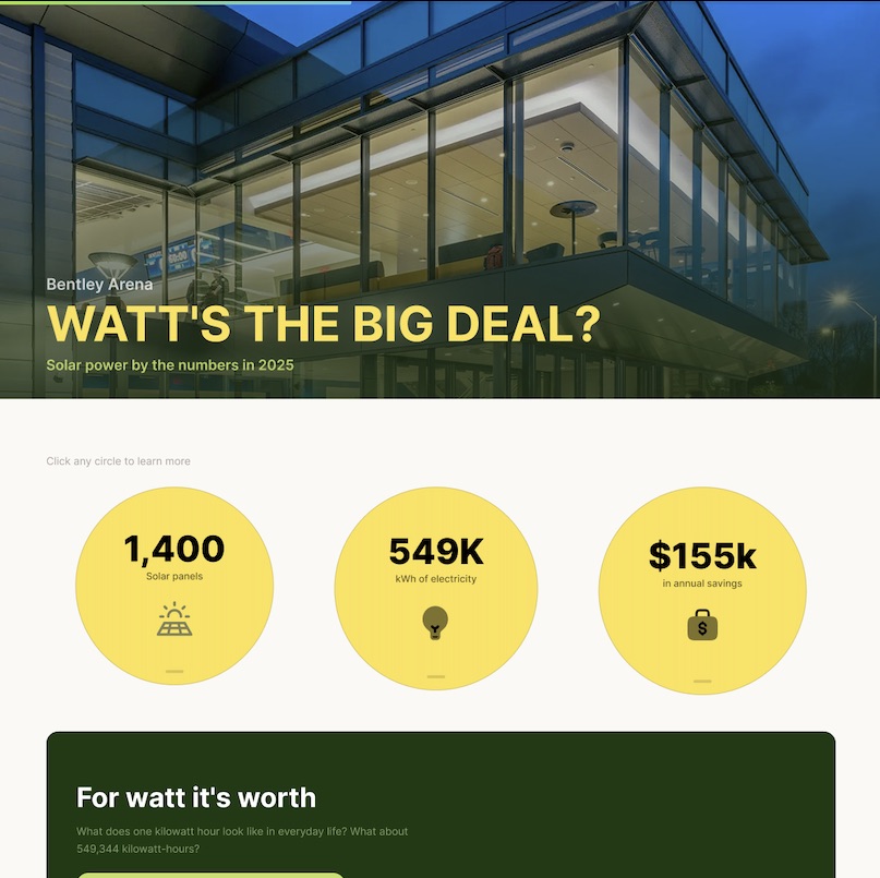
Overview
Watt's the Big Deal?
Client: The Office of Sustainability at Bentley University
Business Problem: Our client wanted to spread awareness that Bentley has and uses solar panels, but they were unsure how to convey the message. They provided a massive collection of data sets regarding solar power production at The Arena, Bentley's ice hockey arena.
Intended Audience: Bentley students, secondary target audience are the university's financial stakeholders.
Goal: With this interactive webpage, I share information about the panels we have in an interactive way. Additionally, I aim to nudge stakeholders towards investing in more panels by highlighting annual savings, as well as projected 25 year savings.
Visualization Solution
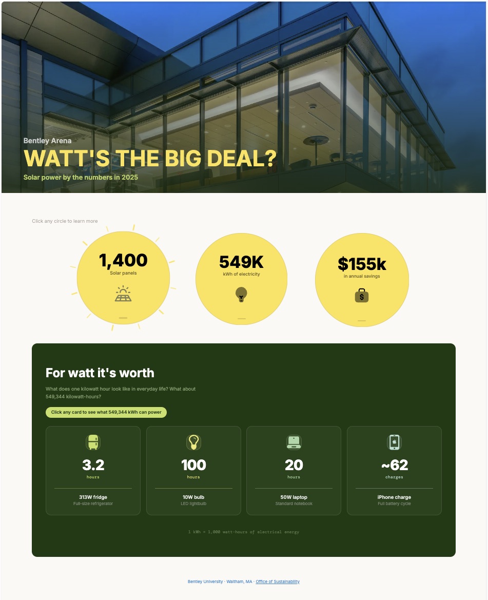
I created an interactive webpage to visualize solar power production data and highlight key facts about the panels in The Arena.
Click the image below to visit the site:
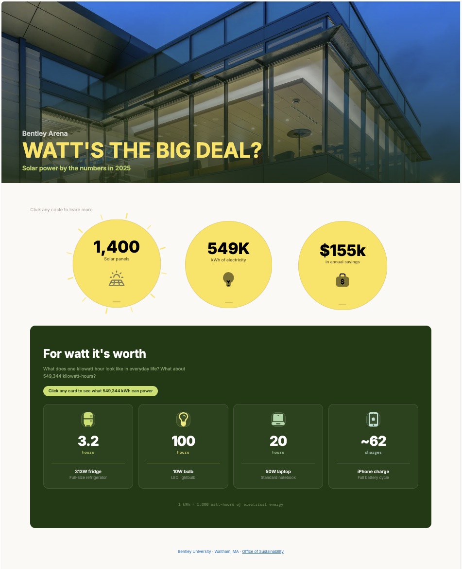
Site Breakdown
Landing Page
│
├── Hero Section
│   ├── Project title
│   ├── Subtitle
│   └── Instruction ("Click any circle to learn more")
│
├── Solar Impact Overview, each with dropdown info panels
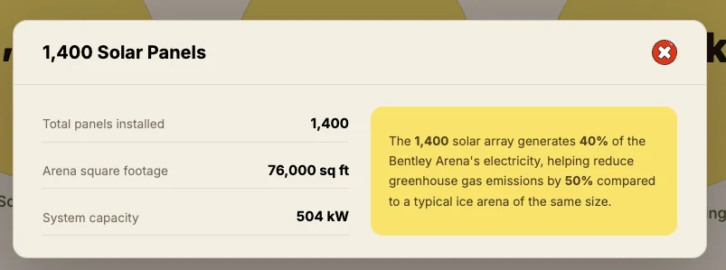
│   ├── 1,400 Solar Panels
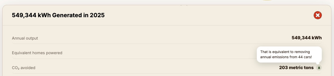
│   ├── 549K kWh Generated
│   └── $155K Annual Savings
│
├── Real-World Energy Equivalents (click to flip cards)
│   ├── Refrigerator
│   ├── LED Light Bulb
│   ├── Laptop
│   └── iPhone Charging
│
└── Footer
    ├── Bentley University
    └── Office of Sustainability
Design Decisions
I made major changes after feedback and reviewing my work.
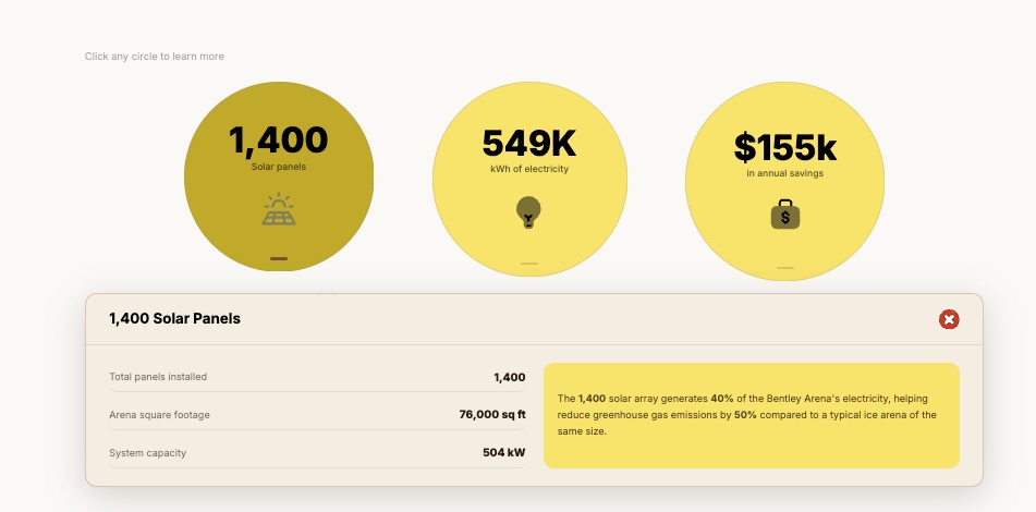
Remove modals
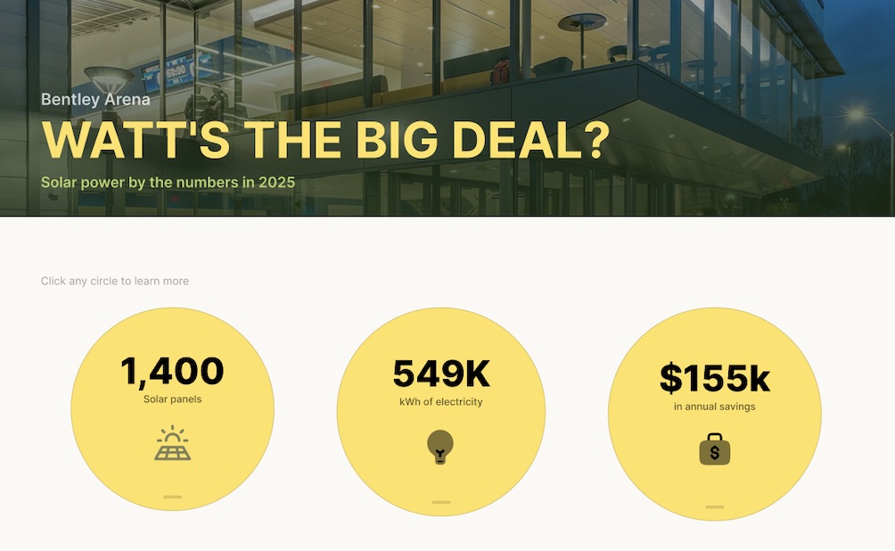
I didn't want users to have to rely on recall when navigating the site. Now, the information panels open as a dropdown below the circles. Additionally, the selected circle turn a darker shade of yellow to make it clear on which panel is open. I incorporated these heuristics to allow users to make decisions with ease.
Add sun ray effect
Rays circle the sun when hovering over a circle, signaling to users that something happens when pressed.
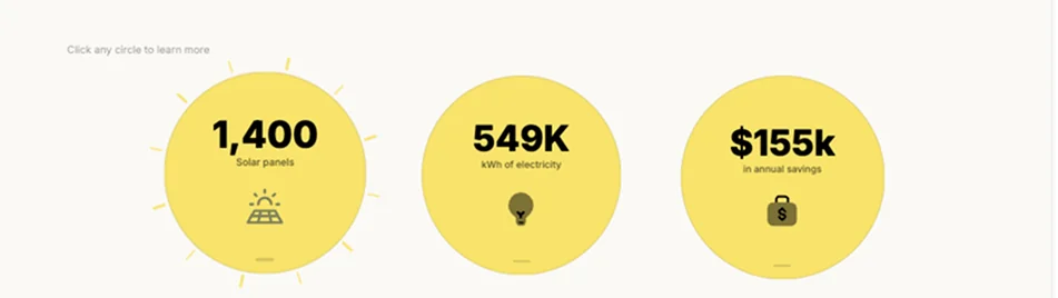
Reduce + group text
I reduced and moved the text in the subtext of the suns. The long text underneath the circle looked more like a sentence. The icons and numbers should let users know the message, with text supporting and providing a bit more information rather than overwhelm the user.
I ended up grouping the subtext with the bold text in the sun. The text labels were previously below each circle. I received feedback that the text didn't seem related to the circle. Using the Gestalt principle of proximity allows users to perceive the elements as being grouped together.
Individual flip state
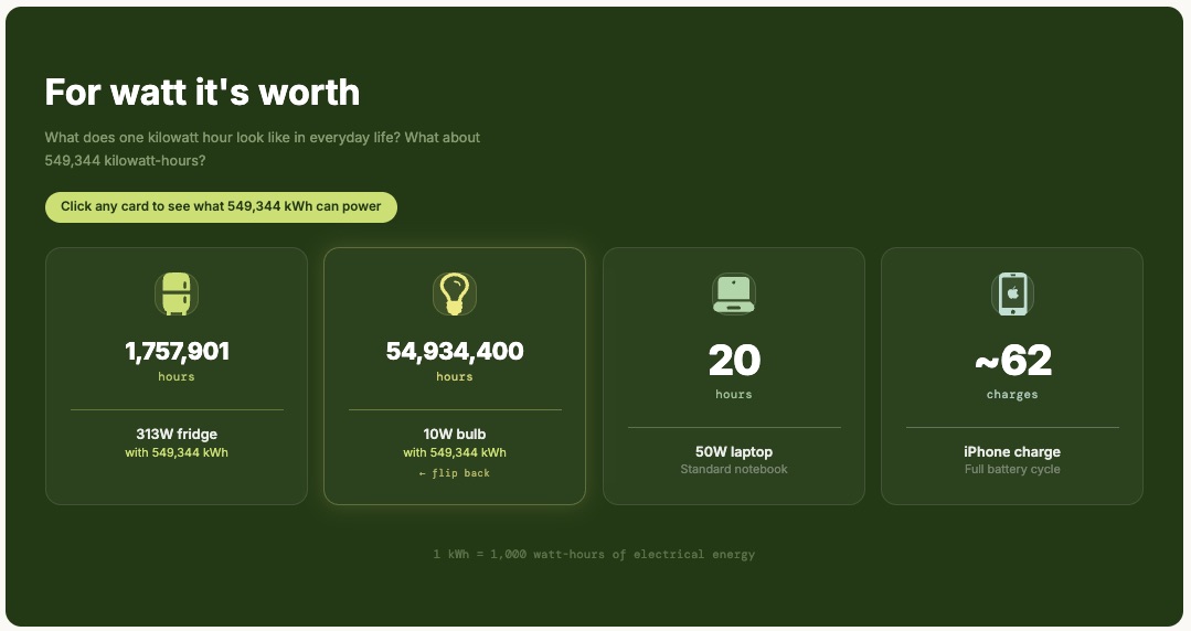
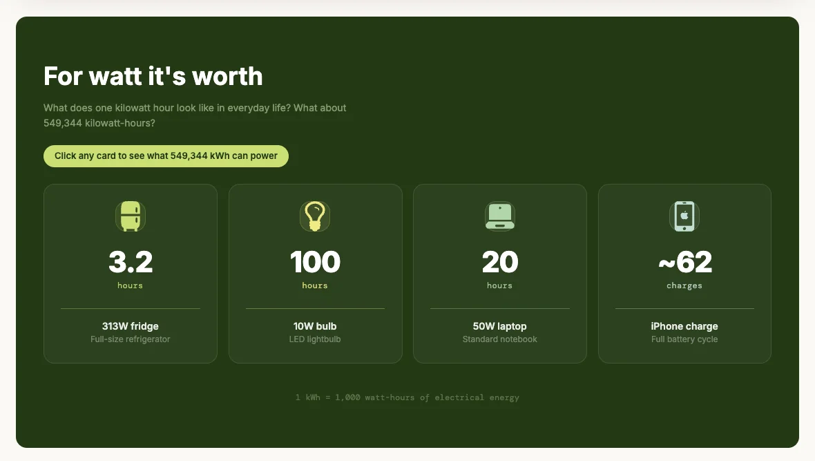
I also got feedback to have each card have its own flip state. Before, there was one "click to flip" button but it could be overwhelming for users to see all the cards flipped. Giving users the ability to flip the cards individually reduces cognitive effort and visual clutter since the flipped state has much larger numbers. This decision was inspired by the Nielsen (2006) article on progressive disclosure. This allows users to disclose (or open) more information when they want or when they are ready.
Datawrapper
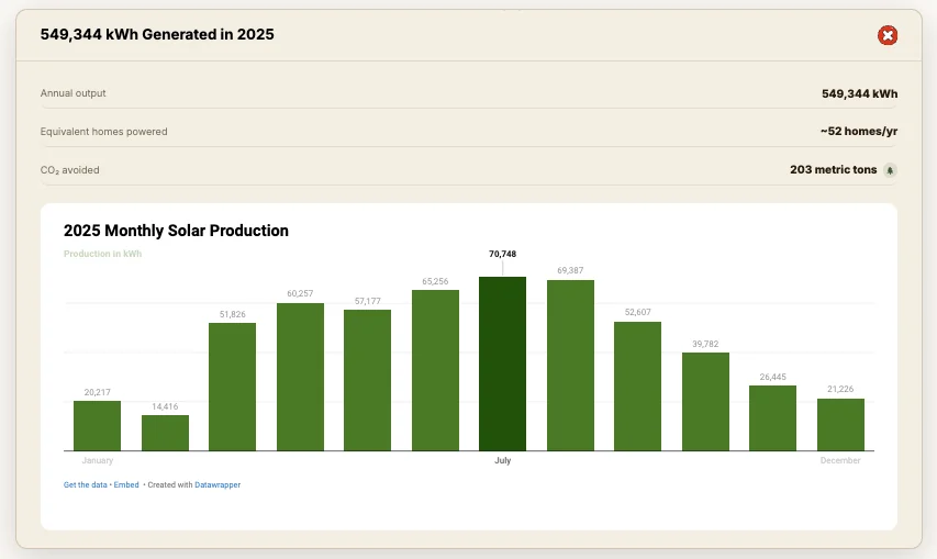
I chose to use Datawrapper to visualize monthly solar production in kilowatt-hours. I embedded the chart into the information panel. I explored different charts but the column chart was simple and effective in showing production. I chose to display the kWh above each column to avoid having users scan across and read the y axis.
Remove Bentley logo
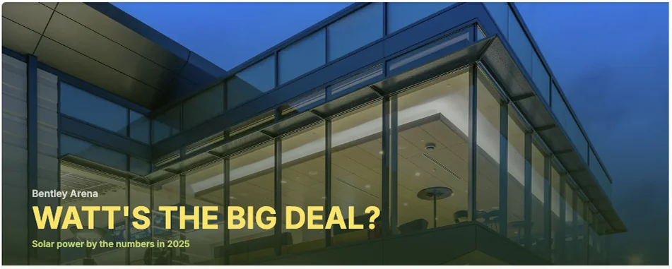
A minor change I made was to remove the Bentley logo from the top of the page. It didn't go well with the colors of my page. I added a picture of The Arena to fill the top width of the site.
Data + Research
I started the process by extracting the data I wanted to use. This was a long process because there was a lot of data! There was daily, weekly, monthly and annual data for energy production, broken down by the different inverters. There was also many months of missing data.
I asked myself: What is the story I want to tell, and which data can I use to do this effectively?
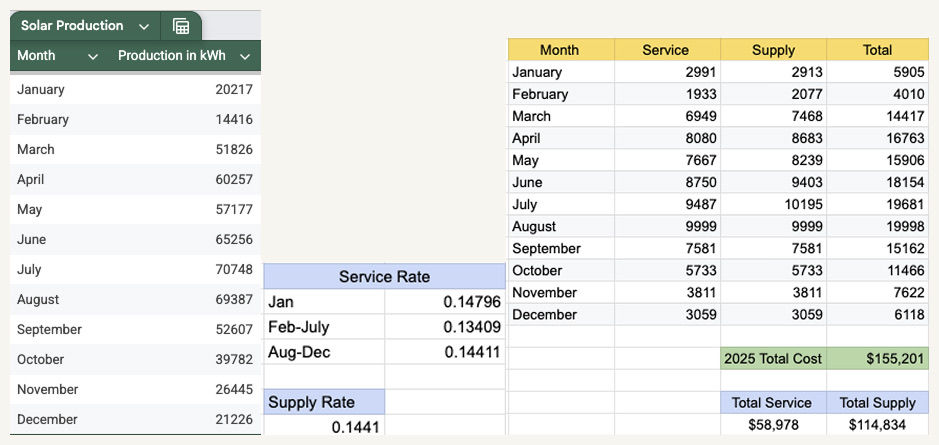
I ended up monthly solar production data of all panels in 2025. I also estimated and calculated projected savings by researching service/supply rates for Massachusetts.
Research + Calculations
How much did Bentley save in 2025 with solar panels?
- I used monthly solar production data provided by the Office of Sustainability for 2025.
- Annual savings was calculated using the total solar panel production of 549,344 kWh in 2025. Using the service/supply rates, I calculated estimated savings of $155,201.
- Calculating the annual cost using service and supply rates for Massachusetts in 2025. I chose National Grid and determined the Arena would be classified as using a G1 commercial rate. Supply rate was fixed at $0.1441, while service rates changed according to the month.
Project Evolution
I began with sketches on paper and Procreate. Originally, I had a static infographic/poster concept for my visualization.
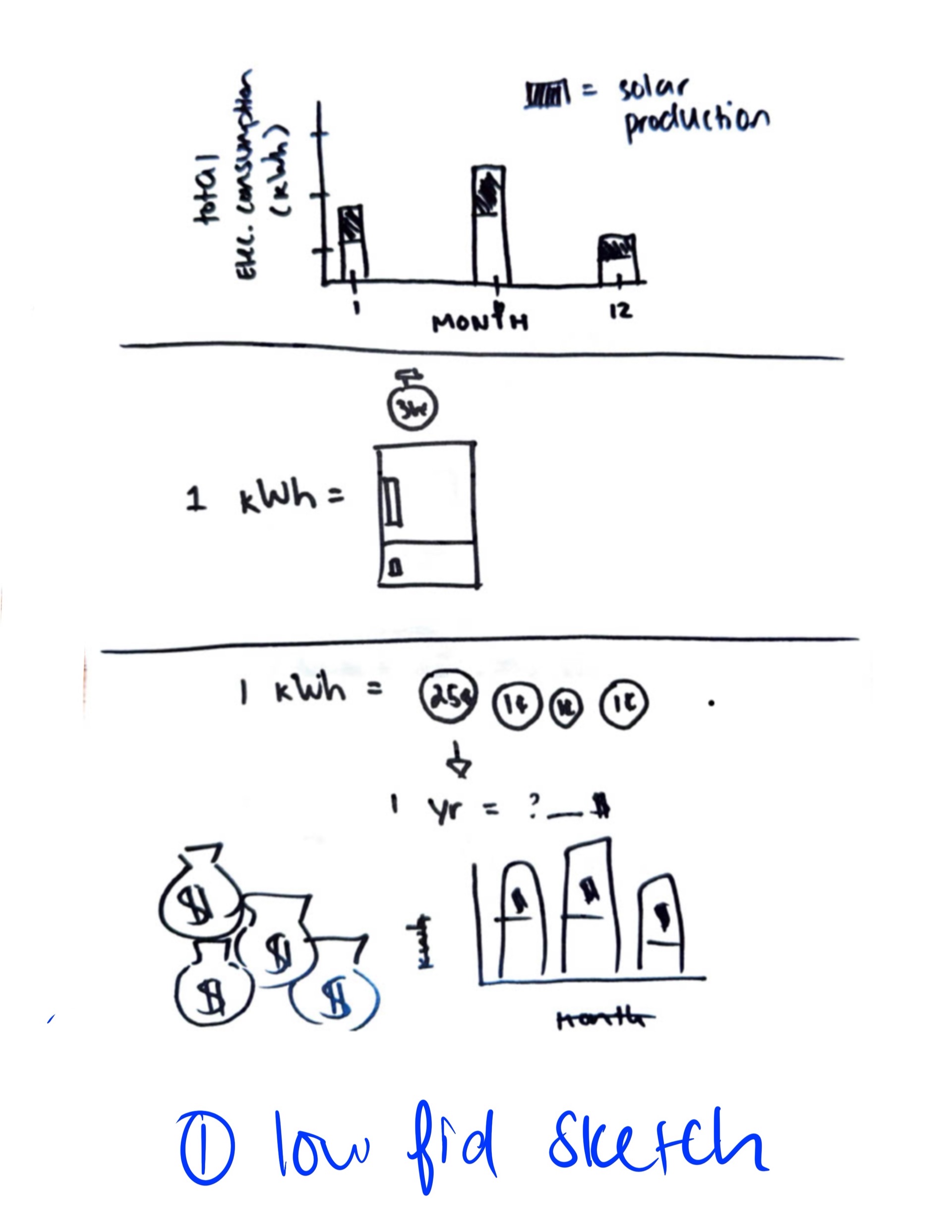
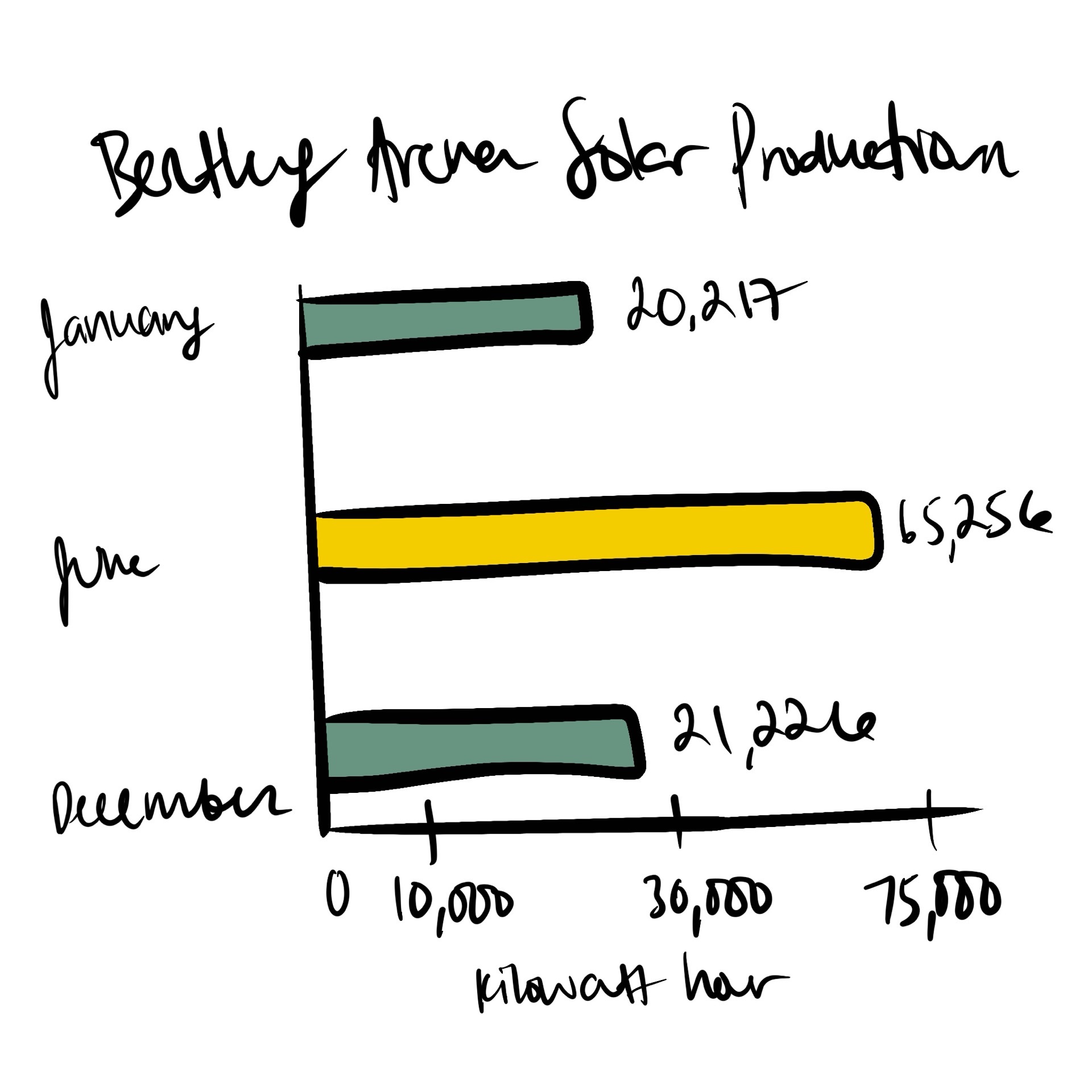
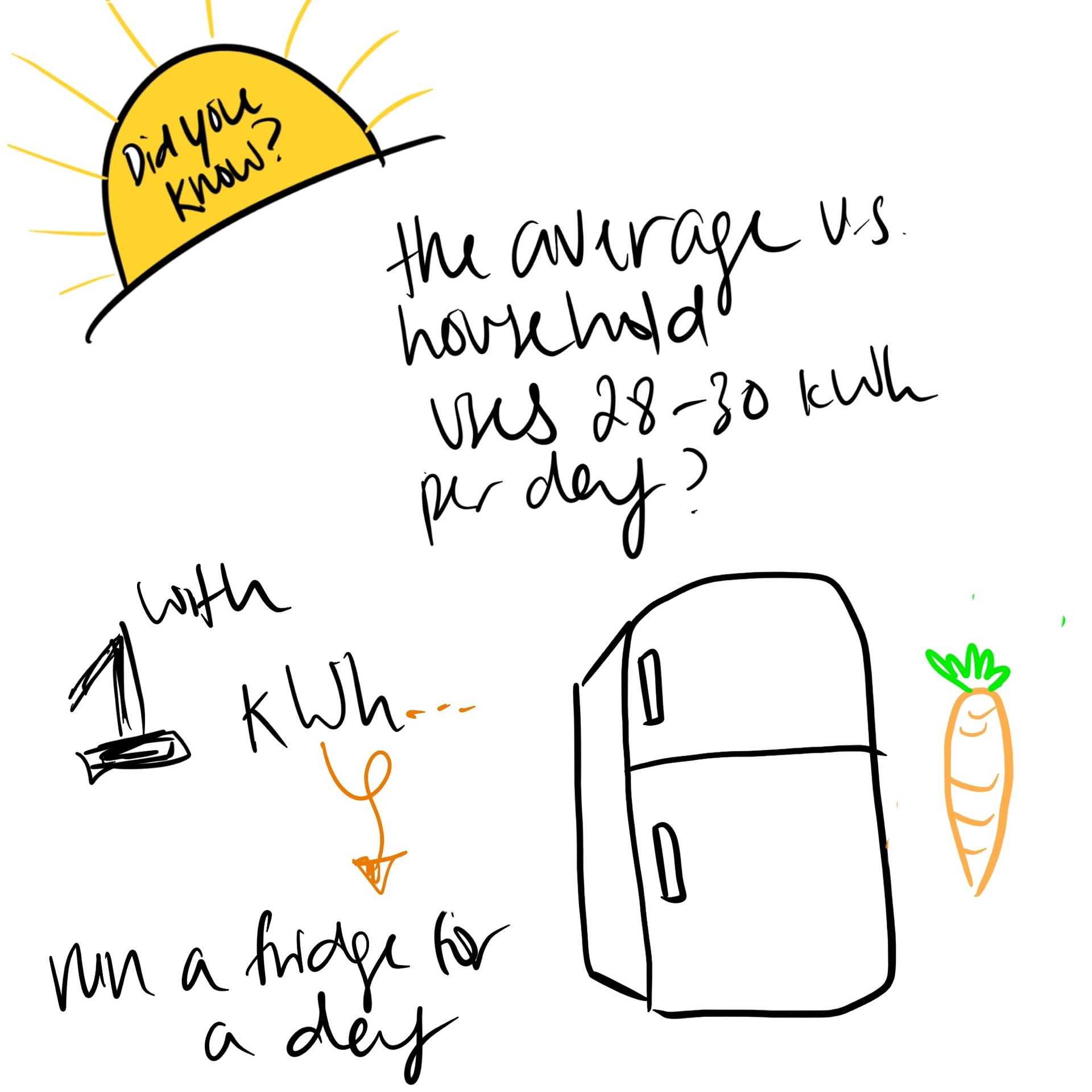
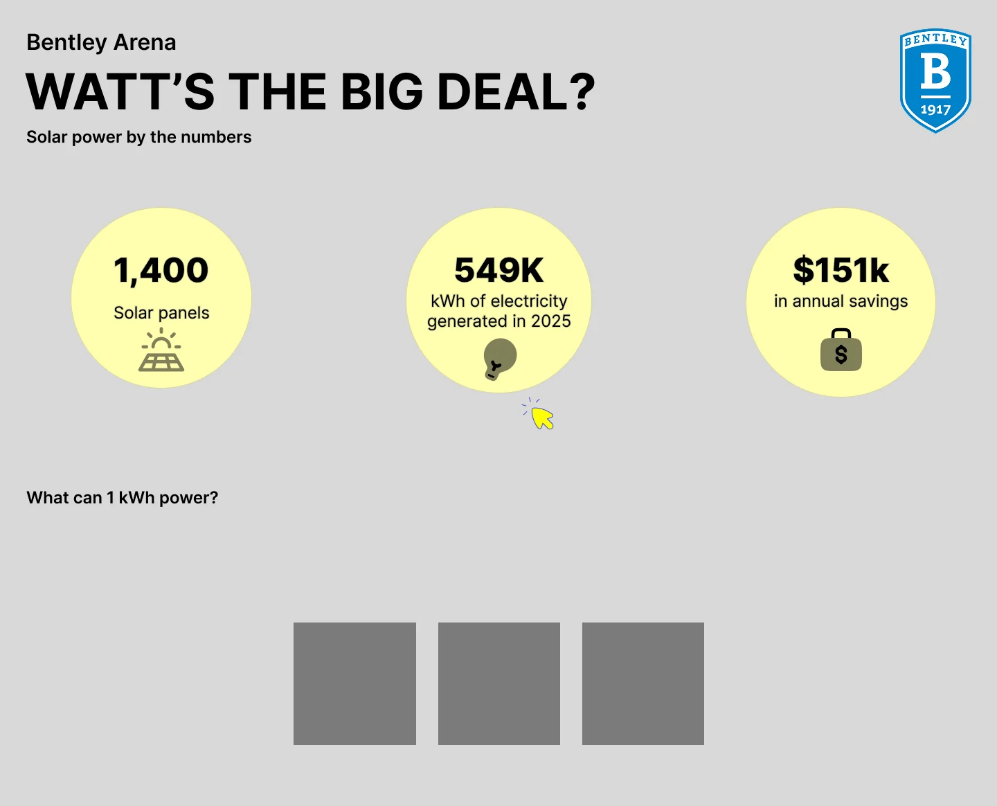
Poster to webpage evolution: still simple wireframes, exploring colors. The image on the right is the final iteration.
Limitations + Future Opportunities
This project had a tight deadline, given that executive format classes only meet for 4 days. Deliverables were due within a day or two after feedback sessions. I would like to expand on this project in the future. There is data that could increase relevance/accuracy for the financial portion. The Office of Sustainability mentioned Bentley buys electricity. I could do a more accurate savings and cost analysis with that information rather than estimating with National Grid data.
Overall, I feel as if there is a lot of room for improvement in the annual savings/projected savings portion of my site.
Let's Connect
If you'd like to talk about AI usage in design, I'd love to hear from you! Have you created interactive prototypes with the help of AI tools? Where do you think AI comes in handy in UX design, and where have you seen it fall short?